You’ve spent months researching your thesis, but a few misplaced centimeters in your layout could easily be the difference between a “Pass” and a “Resubmit.” Before examining boards even read your abstract, they evaluate the physical canvas of your document to see if it meets baseline academic expectations. Read the Best info about espaçamento abnt tcc.
Academic standards dictate this visual first impression through NBR 14724, the official guideline governing Brazilian academic structures. According to university formatting committees, these precise measurements serve a highly practical purpose: they establish professional credibility while ensuring your pages can actually be bound into a physical cover without the glue cutting off your words.
Guidelines for ABNT spacing often feel like a secret code designed to cause panic right at the finish line. Fortunately, setting up your document follows a predictable logic that anyone can master, requiring nothing more than a basic understanding of your word processor and a few specific measurements.
Mastering this layout starts with your line spacing (entrelinha), which functions as the vertical breathing room between your lines of text. As a baseline rule, your standard body text requires exactly 1.5 spacing to comfortably meet NBR 14724 line spacing requirements, giving the reader’s eyes a clean, natural path to follow across the page.
Does your page suddenly look too “crowded” or awkwardly fragmented? Evaluators frequently spot visual inconsistencies because stressed scholars try to manually eyeball their spacing instead of trusting the exact numbers provided by the rules.
In practice, grading rubrics show that students consistently lose points on the following three common spacing mistakes:
- Mixing standard and exception spacing incorrectly: Applying 1.5 spacing to footnotes or bibliographies instead of using the strictly required single space.
- Failing to create visual breaks: Forgetting to shrink the font and push quotes longer than three lines 4cm to the right, which makes it impossible to separate your voice from your sources.
- Using the “Enter” key manually: Hitting the return key multiple times to force text onto a new page, a habit that completely shatters your alignment the moment you add or delete a single sentence.
Reaching total compliance confidence doesn’t mean you must open your paragraph settings menu every time you type a new sentence. By setting up automated “Styles” in Microsoft Word or Google Docs from day one, you can lock in your ABNT spacing rules permanently, saving you hours of frustrating manual adjustments and letting you focus entirely on your research.
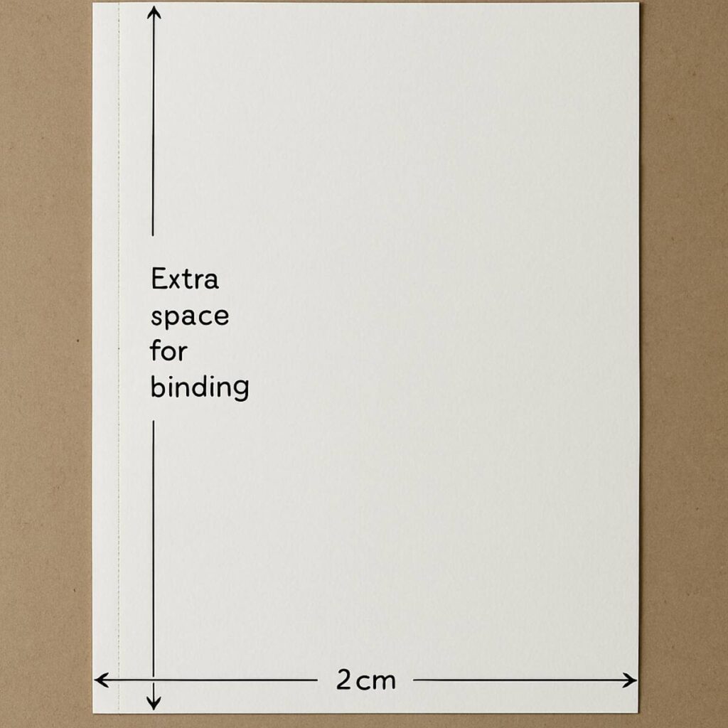
Setting Your Canvas: Why the 3-3-2-2 Margin Rule is Non-Negotiable for Binding
Printing without the correct margin measurements for research papers often leads to disaster. Without a proper physical layout, the bindery might punch holes right through your opening sentences. ABNT requires a specific “white frame” to ensure your work looks professional and survives physical printing.
Think of the page setup standard as the simple 3-3-2-2 rule. Your top and left margin settings for monographs must always be exactly 3cm, while the bottom and right edges shrink to 2cm. That extra centimeter on the left acts as your critical binding allowance, preventing your words from being swallowed by the spine when the document is bound into a hard cover.
Applying these precise boundaries takes less than sixty seconds. Since you already know your way around the ‘Layout’ tab in Word or Google Docs, simply click ‘Margins,’ select ‘Custom Margins,’ and type those four specific numbers into the boxes to permanently set your canvas.
Once your page is securely framed, the next step is managing the crowded space inside it.
The Universal 1.5 Rule: How to Configure Body Text for Maximum Readability
With your protective margins set, the next step is managing the text block inside them through proper entrelinhamento (line spacing). ABNT formatting relies on a predictable vertical rhythm, meaning 90% of your document uses exactly 1.5 line spacing. Think of this measurement as the universal default for all body paragraphs, giving the text room to breathe so your evaluator can read without eye strain.
Many writers mistakenly apply APA’s double-spacing to Brazilian academic papers, assuming all formatting styles are identical. However, NBR standards strictly demand the 1.5 gap to strike a perfect visual balance. Understanding the fundamental difference between 1.5 and single line spacing rules is crucial here; while 1.5 evenly spaces out your main arguments, single spacing shrinks the text block to prevent your page from looking like a continuous, dense wall of words.
Locking this primary rule into your word processor takes just a second by highlighting your text and pressing ‘Ctrl + 5’ to instantly format the vertical gap. Once your body text is automated, you only need to memorize the rare situations where this standard breaks.
The ‘Exceptions’ List: Identifying When to Switch from 1.5 to Single Line Spacing
You might feel tempted to apply your new 1.5 rule everywhere, but that actually violates ABNT standards. The fundamental difference between 1.5 and single line spacing rules comes down to visual hierarchy. Squeezing lines tighter together using single spacing (1.0) instantly signals to your evaluator that a text block is separate from your main argument.
Memorizing these exceptions prevents your page from looking disorganized. NBR guidelines strictly mandate single spacing for five specific structural elements:
- Long quotes exceeding three lines
- Footnotes at the bottom of the page
- Captions for figures and tables
- The “nature of the work” description on your title page
- The bibliography, because formatting references with single line spacing keeps them perfectly compact.
Condensing these specific areas is highly practical. If a lengthy footnote or detailed chart caption remained in 1.5 spacing, it would eat up valuable vertical space and disrupt reading flow. Highlighting these elements and selecting “Single” in your paragraph settings creates a clean visual break, keeping the reader’s focus on your primary research.
Mastering the vertical gaps between your lines is only half the battle; we must also tackle the horizontal gaps at the start of them. Just as vertical spacing follows a predictable logic, beginning a new thought requires a precise measurement.
The 1.25cm Secret: Standard Paragraph Indentation That Meets NBR 14724 Standards
Ever caught yourself tapping the spacebar five times at the start of a new paragraph? This “manual” approach is an amateur mistake that guarantees misaligned text the moment you edit your work. ABNT requires a uniform visual cue to signal a new thought, commonly known as a first-line indent. Instead of guessing the distance, you must set this gap precisely to 1.25cm.
Automating this horizontal jump takes seconds and ensures consistent paragraph breaks throughout your thesis. In your paragraph settings menu, locate the “Special” indentation dropdown. Choose “First line” and type 1.25cm. By saving this exact measurement in your text styles, the software handles the heavy lifting, establishing the standard paragraph indentation automatically every time you press the “Enter” key.
Remember that this 1.25cm rule strictly applies to your body paragraphs, acting distinctly from the rules for indenting bibliographic citations correctly (which actually remain perfectly flush to the left margin). Now that your standard text flows seamlessly, you are ready to tackle the most intimidating ABNT alignment exception.
Mastering the 4cm Recuo: How to Format Long Direct Quotes Without Breaking Your Document
When formatting a lengthy excerpt, standard document layouts often fall apart. When a borrowed thought exceeds three lines, it becomes a “long direct quote.” ABNT rules require a distinct visual break here to signal that another author is speaking. You must physically separate this text using a strict set of alignments rather than hiding it inside standard paragraphs.
To create this separation, you select the entire quoted paragraph and push its left edge inward. Automating this spacing means accessing your word processor’s paragraph settings and configuring the left indentation to exactly 4cm. This single shift establishes a neat, isolated block on the right side of the page without requiring you to hit the spacebar dozens of times.
The internal formatting of this block must also shrink drastically. NBR 10520 citation spacing guidelines dictate reducing the font size—typically from 12 down to 10—and switching from the standard 1.5 to single line spacing. Because this unique, condensed layout acts as a massive visual spotlight for the reader, traditional quotation marks become redundant and must be deleted.
Mastering these isolated blocks ensures outside voices stand out cleanly without disrupting your professional layout. With your citations neatly tucked into their 4cm margins, another crucial alignment challenge awaits.
The Empty Space Strategy: Calculating White Space Between Titles and Body Text
You finally finish typing a brilliant chapter, only to stare at the screen wondering exactly how much room belongs between your new heading and the first paragraph. Many students default to aggressively mashing the ‘Enter’ key until the gap looks visually appropriate, but this habit creates inconsistent vertical separation in academic works. ABNT requires a predictable, uniform approach, ensuring your document maintains a professional structure without any formatting guesswork.
Instead of relying on visual estimation to figure out how many spaces between titles and body text are necessary, implement the standard “one blank line” rule. Since you have already set your document’s default line spacing to 1.5, creating the perfect ABNT-compliant gap is as simple as pressing ‘Enter’ exactly one time. Apply this strict measurement consistently across your entire document:
- 1 blank 1.5 line between your title and the starting text.
- 1 blank 1.5 line between the end of one section and the next subtitle.
Following this straightforward formula prevents your pages from looking unnecessarily crowded or awkwardly stretched. Once your primary headers and text blocks are comfortably locked into this reliable 1.5 rhythm, you must shift your attention to the bottom margin.
Formatting Footnotes: Small Fonts and Tight Spacing for Secondary Information
You already know how to insert a footnote, but making it compliant requires a quick adjustment. While main chapters use a comfortable 1.5 line gap, bottom-of-the-page notes follow a stricter logic. Specific ABNT rules for footnote formatting dictate that secondary information cannot distract from your argument. Simply highlight your footnote text, open your paragraph settings, and change the line spacing to “Single.”
Shrinking this vertical gap creates the necessary visual break. Because these comments sit outside the main flow, they also need a smaller physical footprint. Reduce your font to 10 points, regardless of your chosen typeface. Additionally, justifying text for footnotes is mandatory. You must ensure the words align perfectly with both the left and right margins, forming a neat block at the bottom edge of your canvas.
Mastering these tiny modifications transforms a messy layout into a clean document that passes advisor scrutiny. Once your notes are neatly tucked away in their single-spaced, 10-point blocks, your primary text canvas is complete. Visual elements, however, introduce new structural rules to memorize.
Spacing for Illustrations and Tables: Managing Captions and Source Citations
Inserting a chart often disrupts your layout, leaving text jammed uncomfortably against the graphic. To prevent this crowded look, you must isolate visual elements using proper blank lines. Managing the vertical space around graphics shows the reader precisely where your standard paragraphs end and the illustration begins.
The caption is the first structural element you must manage, and it always sits directly above the visual. Because this text acts as a quick label rather than part of your main argument, it relies on the single spacing rule you just learned to use for footnotes. Highlight your label and select “Single” in your paragraph settings so it stays tightly grouped with the top edge of the image.
Directly beneath the graphic, you must provide a source citation, even if you created the illustration yourself. This bottom label requires a smaller visual footprint to avoid distracting the reader, so reduce the text to font size 10 while maintaining single spacing. Correctly framing these top and bottom elements is crucial for mastering ABNT spacing compliance.
With your illustrations perfectly isolated by one blank line above the caption and another below the source, your chapters will look beautifully uniform. The final formatting hurdle involves applying these exact same condensation principles to your reference list.
Aligning Your Sources: Single Spacing and Left-Alignment Rules for Bibliographies
Reaching the reference list feels like crossing the finish line, but this section has unique layout rules under NBR 6023. Throughout your thesis, you likely used justified text to create crisp, even edges. However, bibliographies require strict left alignment to prevent awkward white gaps from forming between words when you list long document titles or URLs.
For maximum readability, ABNT demands you abandon your standard 1.5 spacing. Instead, focus on formatting references with single line spacing so each publication appears as one compact text block. This tight visual grouping instantly signals to the reader where one specific citation begins and ends without causing visual strain.
The easiest way to pass your advisor’s formatting review is to follow a predictable formula. Before finalizing your document, verify this essential layout checklist:
- Set your paragraph alignment to “Left” (never justified).
- Keep the text spacing within each reference strictly “Single.”
- Insert one blank single-spaced line between individual sources to create clear vertical separation.
- Ensure you are indenting bibliographic citations correctly by leaving the first-line indent at exactly 0cm (no paragraph tabs).
Once this vertical white space is applied, your bibliography will look professionally organized rather than like a chaotic wall of text. Now that your sources are cleanly formatted at the document’s end, we must address the very beginning.
The Abstract and Resumo: Layout and Alignment for International Standards
Having tackled the references, returning to the beginning of your document presents a unique formatting challenge: the abstract. ABNT requires your Resumo and its English counterpart to form one continuous paragraph, stripping away the standard first-line indent used in your chapters. Proper academic abstract layout and alignment demands a unified, solid text block where the entire left edge remains completely flush.
Unlike the main thesis body where 1.5 spacing is the golden rule, this summary section relies entirely on single line spacing rules. This condenses your objective, methodology, and conclusion into a tight, scannable square. To set this up quickly, highlight the paragraph, open your software’s line spacing menu, and select “Single” to ensure the text sits closely together without looking improperly crowded.
Directly beneath this dense paragraph, you must position your keywords so academic databases can index your work. Press “Enter” once after the final sentence to create a single blank line, then list your terms separated by periods.
Cover and Title Page Spacing: Balancing Text for a Professional First Impression
You’ve likely spent hours formatting chapters, making the very first pages feel like an afterthought. However, the standard 3-3-2-2 “white frame” applies immediately, meaning you must preserve the 3cm top and left margin settings even on the cover. Your institution, name, title, and city must be perfectly center-aligned to create a symmetrical, professional entrance to your research.
Moving past the cover, the Folha de Rosto (Title Page) introduces a more complex visual distribution. While your name stays top-aligned and the title sits centered, you must insert an explanatory text block underneath. Proper ABNT formatting dictates that the general 1.5 line gap is temporarily abandoned in this specific section.
This explanatory text—the Natureza do Trabalho (Nature of Work)—requires a distinct visual break so examiners instantly spot your degree objective and advisor’s name. Highlight this paragraph, select “Single” line spacing, and apply a left indent that pushes the text block to the middle of the page, usually at the 7cm or 8cm ruler mark.
Once your title page looks cleanly balanced, your document’s front matter is officially compliant with NBR standards. The final setup task before reaching your actual research chapters is organizing the visual roadmap.
Spacing for the ‘Summary’ (Sumário): Ensuring Clear Navigation for Examiners
Creating a perfectly aligned table of contents often feels like wrestling with your word processor. The Sumário acts as the visual roadmap for your examiners, and keeping it readable requires strict adherence to the default spacing rules. You must apply standard 1.5 line spacing to all your entries, ensuring there is enough uniform separation so the reader’s eye can easily track across the page.
Pressing the period key fifty times to connect a chapter title to its page number is a common trap that completely ruins your formatting the moment a heading length changes. Instead, you need to use your software’s automated “dot leaders” (often found under Tabs or Pontilhado paragraph settings) to generate a perfectly uniform, automated dashed line that bridges the gap flawlessly.
The true mark of a professional document is ensuring every single page numeral locks rigidly flush against the right margin. Mastering these practical rules prevents your work from looking disorganized before the examiner even reads your introduction.
Epigraphs and Dedications: Special Spacing Rules for Personal Touches
Adding a personal touch to your work through optional front matter still requires strict compliance with standard ABNT margin measurements. Even if a page looks mostly blank, you cannot randomly place your text wherever it looks pleasant to the eye. The standard 3cm top and left margins must act as an unmovable, invisible frame for these pages to ensure binding consistency.
Positioning your dedication usually feels awkward because the text is meant to float near the bottom of the page. To achieve the correct layout, you must position your expressions of gratitude specifically in the bottom right quadrant. You can do this by setting a heavy left indent (around 8cm) in your word processor’s ruler and pushing the text down to the final lines of the page, maintaining the standard 1.5 line spacing.
Epigraphs follow a slightly different aesthetic rule, acting as a distinct visual break before your chapters officially start. You must format this inspirational quote using single spacing, position it at the bottom right just like the dedication, and always wrap the original author’s name in parentheses directly beneath the quote.
Automating ABNT Spacing: Creating Professional Styles in Microsoft Word
You’ve likely experienced the panic of pasting a paragraph from a PDF, only to watch your document’s layout completely self-destruct. Instead of manually fixing every broken sentence, you can prevent random formatting shifts when pasting text by leveraging the “Styles” menu. This powerful tool acts as a master template, letting you update the whole document’s spacing in two clicks rather than endlessly scrolling.
Creating custom ABNT styles for instant formatting transforms a tedious chore into a reliable system, configuring 1.5 line spacing once and for all. Follow these steps to create an ‘ABNT Body Text’ style:
- Right click Normal
- Modify
- Format Paragraph
- Set 1.5 spacing and 1.25 indent
Think of these settings as a genetic code for your layout, governed by a background logic called Style Inheritance. When you establish this master design, any foundational rules you tweak automatically trickle down to every single paragraph assigned that style. You immediately eliminate the need to highlight and guess your spacing page by page.
Mastering this centralized control panel guarantees your margins and indents stay perfectly compliant from your introduction straight through to your conclusion.
Google Docs Spacing Hacks: Overcoming Platform Limitations for ABNT Compliance
Replicating strict ABNT compliance in Google Docs requires a slightly different strategy. Docs lacks a robust, centralized template menu for advanced formatting, meaning you must initially set your foundation by navigating to the “Format” tab, selecting “Line & paragraph spacing,” and manually choosing 1.5.
Without automated master styles to lock these rules in forever, your most powerful asset becomes the “Paint Format” icon, visible as a tiny paint roller on your top toolbar. This feature lets you clone flawless formatting from one section to another. Simply highlight a correctly configured sentence, click the roller, and drag your cursor over messy pasted text to instantly transfer the exact line height and font properties.
This cloning technique is especially vital for maintaining the standard paragraph indentation, which mandates a 1.25cm visual gap before starting any new body paragraph. Rather than relying on the highly unpredictable “Tab” key, set your top ruler’s blue markers perfectly just once. The paint roller will then effortlessly copy that precise physical measurement across your entire document.
Eliminating Ghost Spaces: How to Remove Hidden Paragraph Padding
Even if you have already mastered setting 1.5 line spacing, your document might still look strangely stretched out to the naked eye. This happens because modern word processors secretly add hidden padding—often called “Spacing After”—every time you press the “Enter” key to start a new paragraph. Instead of a continuous academic flow, this default setting creates artificial gaps that completely ruin the uniform vertical rhythm throughout your thesis.
Fixing this invisible formatting flaw takes just a few targeted clicks inside the paragraph dialog box you are already familiar with. You must locate the specific section labeled “Spacing” and manually change both the “Before” and “After” point values to exactly 0pt. By zeroing out these numbers, you force the software to stop injecting unauthorized white space between sections, ensuring your document strictly adheres to ABNT compliance without those unpredictable visual jumps.
With those ghost spaces eliminated, your pages will finally look like cohesive scholarly blocks rather than disjointed lists of floating sentences.
The Justified Alignment Trap: Managing Word Spacing in Academic Text
Perfecting your vertical lines often exposes a glaring horizontal problem: awkward, stretched-out gaps between individual words. ABNT rules require “Justified” alignment for body text, meaning your lines must sit completely flush against both the left and right margins. While configuring justified text for university documents guarantees a clean, block-like polish, software achieves this straight edge by artificially forcing extra horizontal space between your words.
These distracting gaps frequently connect vertically to form “rivers of white space” that completely ruin the readability of your work. To fix this instantly, navigate to your word processor’s Layout tab and activate the “Automatic Hyphenation” tool. Allowing the software to cleanly break long academic terms with a hyphen at the right margin eliminates the need for extreme stretching. This practical step ensures your ABNT formatting remains uniform, effortlessly balancing your visual rhythm without requiring you to rewrite entire sentences.
One final detail to check is the very bottom of each paragraph block. The final line must remain strictly left-aligned rather than stretching unnaturally across the entire page, a default behavior you can maintain simply by using a standard “Enter” keystroke.
Final Spacing Audit: A Pre-Submission Checklist for Stressed Scholars
You have transformed a chaotic draft into a professionally structured academic manuscript. The rules that once felt like a stressful secret code are now just predictable, manageable settings in your word processor. You are no longer guessing where the text should go; you are directing it with precision.
However, even carefully formatted documents can suffer from accidental keystrokes or hidden formatting glitches. Before you send that document to your advisor or a print shop, you must run a final visual verification. Performing a systematic review ensures your margins and lines remain perfectly aligned.
Grab a cup of coffee, open your final draft, and perform a 10-point spacing audit. Walk through your document page by page, using the questions below to verify that every structural element sits exactly where it belongs before you consider the formatting process finished.
The ‘Ultimate ABNT Spacing Checklist’:
- Is my left margin and top margin exactly 3cm?
- Is my right margin and bottom margin exactly 2cm?
- Is my general body text set to 1.5 spacing?
- Are my long direct quotes (over 3 lines) single-spaced?
- Do those long quotes have a 4cm indent from the left margin?
- Are my footnotes single-spaced and formatted in size 10 font?
- Are my bibliographic references single-spaced?
- Is there a blank line separating each bibliographic reference?
- Did I remove any accidental empty lines between my regular paragraphs?
- Does the overall page look uniform, clean, and uncrowded?
If you answer “yes” to every question on that list, your required ABNT layout compliance is locked in. If you spot a paragraph that looks too cramped, stop and fix the underlying style setting immediately. Do not rely on manual spacebars or enter keys to adjust the layout.
Once your document passes the audit, there is one final, non-negotiable step: you must export the file to PDF. Different versions of word processors can violently scramble your layout when opened on another computer. Sending an editable document to your advisor is a gamble you cannot afford to take.
Exporting to a PDF essentially “freezes” your text in place. It guarantees that the precise NBR 14724 line spacing requirements you just meticulously applied will display identically on every screen and printer. Your 4cm indents and 1.5 line gaps become permanent, unchangeable fixtures of the page.
You started this journey worried about compliance, but you are now finishing it with complete control over your document formatting. By applying predictable rules and exporting your final layout to a PDF, you guarantee a clean, uniform document on the very first attempt. Print with confidence, hand in your work, and focus on the research you are sharing with the world.