

Welcome to the dynamic, ever-evolving world of Web Development. If you have ever resized your browser window and watched the text, images, and menus magically rearrange themselves to fit the new screen size perfectly, you have witnessed responsive design in action. In today’s digital ecosystem, where users access the internet on everything from massive desktop monitors to tiny smartwatches, mastering web design that adapts to any screen is no longer an optional skill—it is an absolute necessity. Best way to find the Web Development in Dallas.
Whether your goal is to build a simple personal blog, launch an e-commerce empire, or embark on the comprehensive full stack developer roadmap, understanding how to make your interfaces fluid and adaptable is the crucial first step.
This comprehensive guide will walk you through everything you need to know about responsive design. We will explore the foundational code, architectural decisions, and best practices that ensure your websites look beautiful and function flawlessly, no matter the device.
Part 1: The Foundations of Responsive Web Design
Before the smartphone era, web pages were built with fixed dimensions. Designers assumed everyone was viewing their sites on a standard desktop monitor. When mobile phones with web browsers were introduced, these fixed-width sites required constant zooming, pinching, and horizontal scrolling. It was a frustrating experience.
Responsive design solved this problem. Coined by Ethan Marcotte in 2010, the term refers to building websites that automatically adapt to the screen size, orientation, and resolution of the user’s device.
How to Start Coding from Scratch
If you are wondering how to start coding from scratch, the best approach is to build a strong foundation in the core technologies of the web. You do not need expensive software to begin; a simple text editor like Visual Studio Code and a web browser are all you need.
The journey begins with the triad of frontend development. These are the absolute essential programming languages for beginners:
- HTML (HyperText Markup Language): The skeleton of your website. HTML provides the structure, defining what is a heading, a paragraph, an image, or a link.
- CSS (Cascading Style Sheets): The skin and clothing of your website. CSS dictates colors, fonts, layouts, and, most importantly for this guide, how elements adapt to different screen sizes.
- JavaScript: The muscles and nervous system. JavaScript adds interactivity, allowing elements to move, update without reloading the page, and react to user inputs.
To make a website responsive, you will spend the majority of your time working with CSS.
The Mobile-First Philosophy
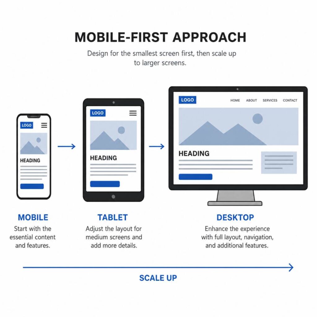
In the early days of responsive design, developers built the desktop version of a site first, and then wrote additional code to scale it down for mobile phones. Today, the industry standard is the exact opposite.
Applying responsive design principles for mobile requires a “mobile-first” approach. This means you design and code the layout for the smallest screens first. Once the mobile view is perfect, you use CSS to progressively enhance the layout as the screen width increases.
Why mobile-first?
- Performance: Mobile devices often have slower processors and weaker internet connections. By loading the simplest layout first, the site appears faster.
- Clarity: Mobile screens force you to prioritize the most important content. You cannot hide behind a messy layout when you only have 300 pixels of width to work with.
- User Experience: With over 50% of global web traffic coming from mobile devices, optimizing for mobile first ensures the majority of your users have a flawless experience.
Part 2: The Technical Pillars of Responsive Design
Responsive web design relies on three core technical concepts: the viewport meta tag, fluid grids, and media queries. Let’s break down how each contributes to a seamless user experience.
1. The Viewport Meta Tag
If you do not tell a mobile browser that your site is responsive, the browser will assume it is a fixed-width desktop site and try to shrink the entire page to fit the screen. This makes text unreadable and links impossible to tap.
To fix this, you must include the viewport meta tag inside the <head> of your HTML document:
<meta name=”viewport” content=”width=device-width, initial-scale=1.0″>
This simple line of code tells the browser: “Set the width of the webpage to the width of the device, and set the initial zoom level to 100%.” It is the absolute first step in any modern Web Development project.
2. Fluid Grids (Flexbox and CSS Grid)
Historically, developers used pixels (px) to define the width of elements. A sidebar might be exactly 300px wide. However, pixels are absolute units. If a user’s screen is only 280px wide, that sidebar will overflow the screen, causing an ugly horizontal scrollbar.
Responsive design uses relative units like percentages (%), viewport width (vw), and viewport height (vh). Instead of saying a column is 300px wide, you say it takes up 50% of the available space.
Modern web design handles fluid grids through two incredibly powerful CSS layout modules:
- CSS Flexbox: Ideal for one-dimensional layouts (arranging items in a single row or a single column). Flexbox allows items to grow to fill available space or shrink to prevent overflowing.
- CSS Grid: Designed for two-dimensional layouts (handling both rows and columns simultaneously). Grid allows you to create complex magazine-style layouts that easily reorganize themselves on smaller screens.
3. CSS Media Queries
Media queries are the true magic behind responsive design. They act as “if/then” statements for your CSS. They allow you to apply different styles only when certain conditions (like screen width) are met.
Here is a practical example of a mobile-first media query:
/* Base styles applied to all devices (Mobile First) */ .content-box { width: 100%; padding: 10px; } /* Styles for tablets and larger screens */ @media (min-width: 768px) { .content-box { width: 50%; padding: 20px; } } /* Styles for large desktop monitors */ @media (min-width: 1200px) { .content-box { width: 33.33%; } }
In this example, the .content-box will stack vertically (taking up 100% of the screen) on mobile phones. On tablets, two boxes will sit side-by-side (50% each). On large desktops, three boxes will fit in a row (33.33% each).
Part 3: Images, Typography, and User Experience
A responsive layout is only half the battle. If your images stretch out of proportion or your text is too small to read on a phone, the user experience will suffer.
Fluid Typography
Just as container widths need to scale, so does text. While you can use media queries to change font sizes (font-size: 16px on mobile, font-size: 20px on desktop), modern developers prefer a more fluid approach.
By using viewport units like vw (viewport width) or CSS functions like clamp(), typography can smoothly scale up and down alongside the screen size.
h1 { /* Minimum 2rem, preferred size dynamically scales, Maximum 4rem */ font-size: clamp(2rem, 5vw, 4rem); }
Responsive Media
High-resolution images look great on massive desktop monitors but are a disaster for mobile users on weak 4G connections. Loading a 5MB desktop image on a mobile phone wastes bandwidth and dramatically slows down your site.
To solve this, developers use the srcset attribute in HTML. This allows you to provide multiple versions of the same image, and the browser will automatically download the most appropriate size for the user’s screen.
<img src=”small-image.jpg” srcset=”small-image.jpg 500w, medium-image.jpg 1000w, large-image.jpg 2000w” alt=”A beautiful landscape demonstrating responsive image loading”>
User Experience Design Fundamentals
Building responsive sites requires a deep understanding of user experience design fundamentals. It is not just about making things fit; it is about making things usable.
When adapting your design for touch screens, consider the following actionable tips:
- Touch Targets: Human fingers are larger than mouse pointers. Buttons, navigation links, and form inputs must be at least 44×44 pixels to ensure users can easily tap them without accidentally hitting the wrong link.
- Navigation: A horizontal row of links works well on a desktop monitor, but it will crowd a mobile screen. Implementing a “hamburger menu” (the three-line icon that toggles a hidden menu) or a bottom tab bar keeps mobile interfaces clean.
- Hover States: Mobile devices do not have a “hover” state. If you hide crucial information behind a CSS :hover effect, mobile users will never see it. Always ensure essential information is visible by default or accessible via a tap.
Part 4: Stepping Back – The Bigger Picture of Web Development
As you master responsive frontends, it is crucial to understand where this fits into the broader software engineering ecosystem. Crafting the visual layout is only one piece of the puzzle.
Differences Between Frontend and Backend
To build robust applications, you must understand the differences between frontend and backend development.
- The Frontend (Client-Side): This is everything the user sees, touches, and interacts with. It involves HTML, CSS, JavaScript, and the responsive design techniques we have discussed so far. It runs entirely inside the user’s web browser (like Chrome or Safari).
- The Backend (Server-Side): This is the hidden machinery that powers the website. It involves servers, databases, and server-side programming languages (like Python, Node.js, Ruby, or PHP). The backend handles user authentication, processes payments, and stores data securely.
A developer who is proficient in both the frontend interface and the backend logic is known as a Full Stack Developer.
Integrating Data and APIs
How does a responsive frontend get its content? It usually requests it from the backend. This is done through application programming interface integration.
An API acts as a messenger. Your frontend JavaScript sends a request to the backend API saying, “Please send me the latest blog posts.” The API retrieves this data from a database and sends it back to the frontend in a structured format (usually JSON). Your responsive frontend then takes that data and dynamically generates the HTML and CSS to display it beautifully on any device.
Understanding Databases
When your API requests data, it pulls from a database. Depending on the project, a backend developer will choose between relational vs non-relational databases:
- Relational Databases (SQL): Examples include MySQL and PostgreSQL. Data is stored in strict tables with predefined rows and columns. This is ideal for complex, highly structured data, like an e-commerce store with strict inventory, user, and order relationships.
- Non-Relational Databases (NoSQL): Examples include MongoDB and DynamoDB. Data is stored in flexible, document-like structures. This is highly scalable and great for rapidly changing data, such as real-time social media feeds or IoT sensor data.
No matter which database is used, the goal is the same: deliver data to the frontend so your responsive CSS grids can display it to the user.
Part 5: Rendering, Performance, and Accessibility
When building modern websites, how your content is delivered to the screen dramatically affects both performance and search engine rankings. Let us look at how advanced rendering techniques and optimization play into responsive design.
Server-Side vs Client-Side Rendering
There is an ongoing debate in modern development regarding server-side vs client-side rendering. Understanding this distinction is vital for optimizing how quickly your responsive layout appears on a user’s screen.
- Client-Side Rendering (CSR): With CSR, the server sends a nearly empty HTML file and a massive JavaScript bundle to the user’s browser. The browser must download, parse, and execute the JavaScript before the user sees anything. While this allows for highly interactive, app-like experiences (Single Page Applications built with React or Vue), it can result in a slow initial loading screen, particularly on older mobile devices.
- Server-Side Rendering (SSR): With SSR, the backend server processes the requested page and sends a fully formed, complete HTML document to the browser. The browser can immediately render the HTML and apply your responsive CSS without waiting for heavy JavaScript. This results in incredibly fast initial load times, which is critical for mobile users on weak cellular connections, and it is highly beneficial for SEO.
Modern meta-frameworks like Next.js and Nuxt have popularized a hybrid approach, allowing developers to use SSR for initial page loads and CSR for subsequent interactivity.
Website Performance Optimization Techniques
Responsive design is deeply tied to performance. A site that looks great on a mobile phone but takes 10 seconds to load provides a terrible user experience. Here are critical website performance optimization techniques you must implement:
- Minification: Before deploying your website, run your HTML, CSS, and JavaScript files through a minifier. This process removes all unnecessary whitespace, comments, and line breaks, reducing the overall file size so it downloads faster.
- Lazy Loading: Do not force the browser to download images that are hidden at the bottom of the page. By adding the loading=”lazy” attribute to your <img> tags, the browser will only download images as the user scrolls near them.
- Content Delivery Networks (CDNs): A CDN stores copies of your website’s static files (images, CSS, JS) on servers located all around the globe. When a user in Japan visits your site, they download the files from a server in Tokyo, rather than waiting for data to travel from your main server in New York.
- Optimized Font Loading: Custom web fonts can be large files. Preloading essential fonts and utilizing font-display: swap in your CSS ensures that text becomes immediately visible in a fallback font while the custom font finishes downloading.
Web Accessibility Standards Compliance
A truly responsive website is not just responsive to screen sizes; it is responsive to human needs. Web accessibility ensures that people with disabilities—including visual, auditory, motor, or cognitive impairments—can use your site effectively.
Strict adherence to web accessibility standards compliance (such as the Web Content Accessibility Guidelines, or WCAG) is legally required in many jurisdictions and is a moral imperative for developers.
Key accessibility practices include:
- Semantic HTML: Using the correct HTML tags for their intended purpose. Use <nav> for navigation, <main> for the primary content, and <button> for clickable actions. Screen readers rely on semantic HTML to navigate the page for visually impaired users.
- Color Contrast: Ensure there is sufficient contrast between your text color and background color. Light gray text on a white background is incredibly difficult to read, especially on a mobile screen out in the bright sun.
- Keyboard Navigation: Not everyone can use a mouse or a touchscreen. Your responsive website must be fully navigable using only the Tab and Enter keys on a keyboard. Ensure that interactive elements have a clear, visible focus state.
- ARIA Labels: When building complex custom UI components (like a custom dropdown menu), use Accessible Rich Internet Applications (ARIA) attributes to clearly communicate the component’s state (e.g., expanded or collapsed) to assistive technologies.
Part 6: Tools, Testing, and Deployment
Building a responsive website on your personal computer is only the beginning. To thrive in a professional environment, you need to understand how to manage your code, test it rigorously, and deploy it to the world.
Managing Your Code
As your project grows, managing thousands of lines of CSS and JavaScript becomes chaotic. What if you make a mistake and break your responsive layout? How do you undo it? How do you collaborate with other developers without overwriting each other’s work?
The solution is version control with git and github.
- Git is a version control system installed on your local computer. It acts like a time machine for your code, taking “snapshots” of your project as you work. If you accidentally delete a crucial CSS media query, Git allows you to instantly revert to a previous, working version.
- GitHub is a cloud-based hosting service for Git repositories. It allows developers to store their code online, share it with teammates, review code changes via “Pull Requests,” and track bugs and issues.
Mastering Git is an absolute requirement on the full stack developer roadmap.
Cross-Browser Testing
Just because your website looks perfect on Google Chrome on your laptop does not mean it will look identical on Safari on an iPhone or Firefox on a Linux machine. Different web browsers use different rendering engines, and they sometimes interpret CSS rules differently.
Testing for cross-browser compatibility is a vital step before launching any site.
- Manual Testing: Resizing your browser window, opening the site on your actual smartphone, and asking friends to check the site on their devices.
- Browser DevTools: Every modern browser has built-in Developer Tools. By pressing F12, you can open a panel that allows you to simulate dozens of different mobile devices, throttling network speeds to test performance, and inspecting your CSS in real-time.
- Automated Services: For professional projects, developers use services like BrowserStack or LambdaTest. These platforms allow you to test your site on hundreds of real, physical devices remotely via the cloud, ensuring total compatibility.
Deployment and Hosting
Once your responsive site is tested and ready, it needs a permanent home on the internet. This brings us to the debate of cloud hosting vs local servers.
In the past, businesses had to purchase physical hardware, install it in a server room, maintain internet connections, and manage cooling systems. This is known as on-premise or local server hosting. It is expensive, difficult to scale, and prone to hardware failure.
Today, the industry relies almost entirely on cloud hosting. Companies like Amazon Web Services (AWS), Google Cloud, and Microsoft Azure rent out server space in massive, highly secure data centers. For frontend developers building responsive sites, platforms like Vercel, Netlify, and GitHub Pages have revolutionized deployment. By linking your GitHub repository to these services, your website will automatically rebuild and deploy to the global cloud every time you push a code update. This provides infinite scalability, high security, and lightning-fast global delivery for a fraction of the cost of running a local server.
Content Management Systems (CMS)
If you are building a website for a client, they will likely want to update the text and images themselves without having to touch HTML or CSS. This requires choosing a content management system.
A CMS provides a user-friendly dashboard where non-technical users can write blog posts, upload products, and edit pages.
- Traditional CMS: Platforms like WordPress power over 40% of the internet. WordPress uses “themes” to control the frontend layout. When building for WordPress, you must ensure your custom theme is fully responsive.
- Headless CMS: A modern approach where the CMS (like Sanity, Contentful, or Strapi) only handles data storage and the backend API. It has no built-in frontend. Developers fetch data from the Headless CMS via API integration and use React, Vue, or vanilla HTML/CSS to build a completely custom, highly performant responsive frontend. This decoupling of the backend content from the frontend presentation is highly favored in enterprise-level Web Development.
Part 7: Actionable Workflow – Bringing It All Together
To solidify these concepts, let us map out a practical, step-by-step workflow for creating a responsive web page from scratch using the principles we have discussed.
Step 1: Planning and UX Design Before writing a single line of code, sketch out your layout. Decide what the user experience design fundamentals dictate for your project. Sketch the mobile view first. Identify the core message, place the call-to-action prominently, and plan a collapsible navigation menu. Then, sketch how the layout will expand for tablet and desktop views.
Step 2: Setup and Boilerplate Initialize a new project folder. Create an index.html file, a style.css file, and an app.js file. Open your terminal, initialize version control with git init, and create your first commit to secure your starting point. Do not forget to include the critical <meta name=”viewport” content=”width=device-width, initial-scale=1.0″> tag in your HTML.
Step 3: Semantic HTML Structure Write the HTML structure. Use semantic tags like <header>, <nav>, <main>, <section>, <article>, and <footer>. Ensure you are incorporating web accessibility standards compliance by adding descriptive alt text to any image placeholders and ARIA labels to your navigation buttons.
Step 4: Mobile-First CSS Open your style.css file. Write the CSS required to make the site look perfect on a mobile phone. Utilize CSS Flexbox to stack elements vertically. Use relative units like percentages for widths and clamp() for fluid typography. Ensure your touch targets are large and accessible.
Step 5: Progressive Enhancement with Media Queries Once the mobile view is complete, slowly widen your browser window. When the layout starts to look stretched or awkward, that is where you need a “breakpoint.” Add a @media (min-width: …) query and use CSS Grid or Flexbox to place elements side-by-side. Repeat this process for tablet, laptop, and ultra-wide monitor breakpoints.
Step 6: Optimization and API Integration If your site requires dynamic data, write the JavaScript needed for application programming interface integration to fetch content from your backend or Headless CMS. Implement website performance optimization techniques: compress your images, set up lazy loading, and minify your stylesheets.
Step 7: Testing Open Chrome DevTools and thoroughly inspect the site across all simulated mobile devices. Next, engage in rigorous testing for cross-browser compatibility by opening the site in Safari and Firefox. Navigate the site using only your to double-check accessibility.
Step 8: Deployment Push your final code to GitHub. Connect your GitHub repository to a cloud hosting provider like Netlify or Vercel. Within seconds, your fully responsive, optimized, and accessible website will be live on the global internet.
Conclusion
The landscape of Web Development is constantly shifting. New devices, varying screen sizes, and innovative browser capabilities are introduced every year. However, the foundational goal remains the same: delivering information clearly, efficiently, and beautifully to the end user.
Responsive design is not merely a checklist of CSS tricks; it is an empathetic approach to web design. By embracing fluid grids, mobile-first philosophies, and rigorous performance optimizations, you ensure that your digital creations are accessible to everyone, regardless of the device in their hands or the speed of their internet connection.
Whether you are just figuring out how to start coding from scratch or you are advancing through a complex full stack developer roadmap, the principles of responsive web design will remain a cornerstone of your skillset. Practice building layouts, experiment with CSS Grid and Flexbox, and always keep the user experience at the forefront of your mind. Happy coding!